Visual Design | Prototype
Project Overview
The ECHO project is a series of projects from Visual Design 1 where I had to design a company's logo, style guide, webpage, and presentation—essentially, creating a brand identity within a month or two. These projects will focus on a famous music label company, HYBE Label, and I want to create a logo for a fictional music group/artist.
Project Background
Mission – “The hope you seek is above your skies”.
The mission of HYBE Label is simply to be a talent agency and music label for a variety of groups and other subsidiaries. For my hypothetical music group, I decided to name ECHO. The concept is focused on how the music that we create is connected to our emotions. The music that we enjoy that makes us feel good (or bad) essentially will always be within us, echoing. The designs will involve space, like moons and planets.
Since sound does not travel through space, it is a sad reminder that we could also lose touch with ourselves or others.
This idea will be used throughout the creation of ECHO, including the webpage prototype. One of the final projects in the ECHO series.
Programs used: Adobe Photoshop
Project Goals
- Create a brand identity.
- Create a functional webpage layout using the style guide.
- Incorporate visual design elements into the webpage prototype.
Method
For my webpage prototype, I used the style guide I created in the previous project. Since I already had an idea of the colors and typography, it didn't take me too long to think of ideas. Furthermore, I used HYBE's website as a guide to create the prototypes since this music group is an extension of them.
When I studied HYBE's website, I noticed that they had a main site for the company and then other smaller websites for their artists. They didn't use the same color scheme and patterns for all their groups because they had different themes and stories. However, these websites all had a similar layout. For example, in my prototype, I created four main pages: Homepage, Discography, About ECHO, and Tours.
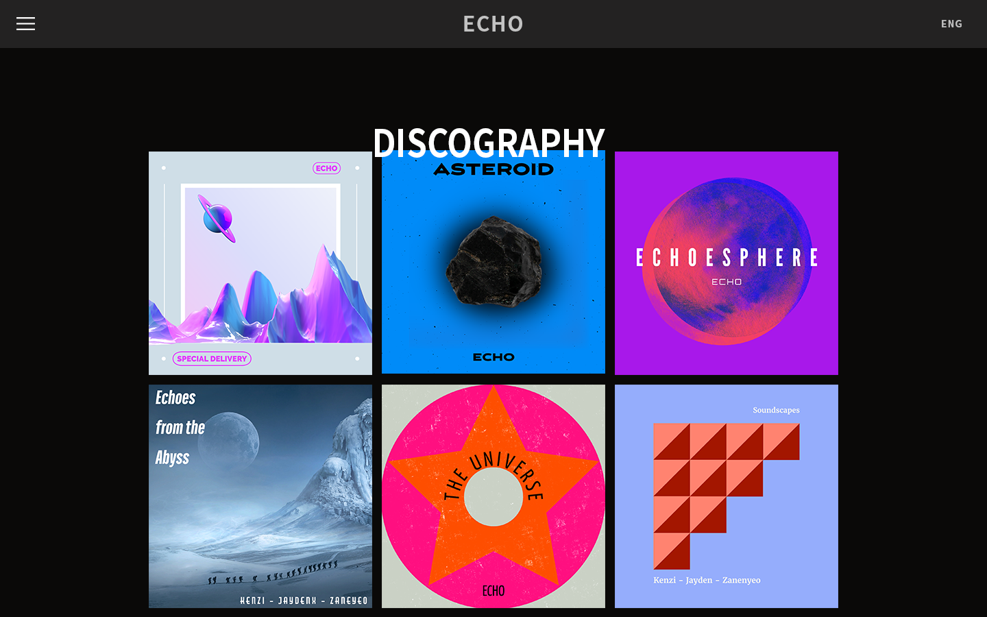
The album covers were created using Adobe Express as this was a quick project. Furthermore, the image in the About ECHO page is from a sub-unit of Day6, a K-rock group under the JYP Entertainment label. I used their image for the purpose of this project and of course, all image credits for that goes to them!

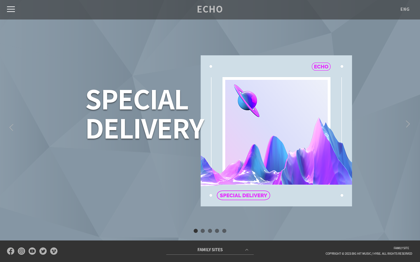
The ECHO group homepage with a featured album release.

A catalog of ECHO's released albums over the years.

A small about page about ECHO. This image was taken from Day6's website. All image credits: JYP Ent.

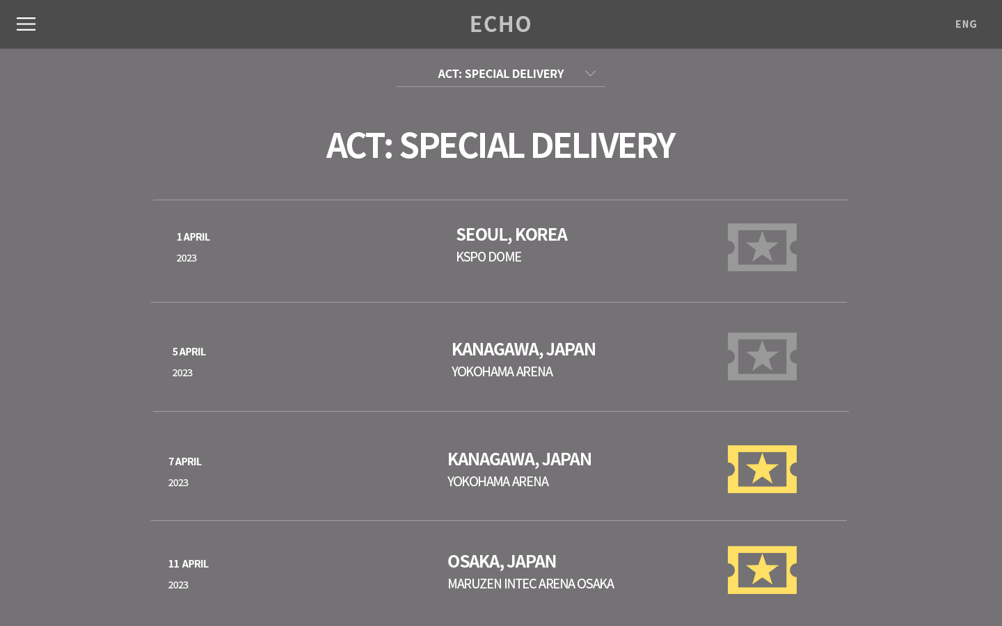
A tour schedule with tickets included.
Key Takeaways
Overall, I had a lot of fun creating these webpage layouts. I never thought how far it took for some companies to develop an entire brand identity for themselves. Let alone, for multiple groups under them that try to keep a cohesive style and theme together.
One of the most difficult parts of the ECHO project was keeping up with the themes and styles myself. You can easily get lost in the process or be attached to something that wouldn't make sense to keep. As for using Photoshop, I used my previous knowledge from the Queen Tea Menu Redesign project for this project. Creating the artboards made it a lot easier (and faster) to create these pages in a timely manner.
If given more time, I want to create more pages and possibly redesign the About ECHO page. Obviously, it can't be perfect, but I think that it could use a little more love!