Visual Design
Project Overview
The ECHO project is a series of projects from Visual Design 1 where I had to design a company's logo, style guide, webpage, and presentation—essentially, creating a brand identity within a month or two. These projects will focus on a famous music label company, HYBE Label, and I want to create a logo for a fictional music group/artist.
Project Background
HYBE Label is a South Korean entertainment company owned by Bang Si-hyuk, the founder of Big Hit Entertainment. This is the same company that created the popular boy group, BTS. What is exciting about designing for a music label in South Korea is the storytelling element involved. Many groups and artists have lore in their music videos and trailers.
These stories often tell stories of heartbreak, adulthood, etc. And often, these stories can create a whole series that span the years of their lives as they continue to make music.
Mission – “The hope you seek is above your skies”.
The mission of HYBE Label is simply to be a talent agency and music label for a variety of groups and other subsidiaries. For my hypothetical music group, I decided to name ECHO. The concept is focused on how the music that we create is connected to our emotions. The music that we enjoy that makes us feel good (or bad) essentially will always be within us, echoing. The designs will involve space, like moons and planets.
Since sound does not travel through space, it is a sad reminder that we could also lose touch with ourselves or others.
This project in particular focuses on creating a logotype for my brand.
Programs used: Adobe Illustrator, Adobe Photoshop, Procreate
Project Goals
- Create a company's brand identity.
- Design a logotype.
- Explain the design choices using terms from Visual Design 1.
Method
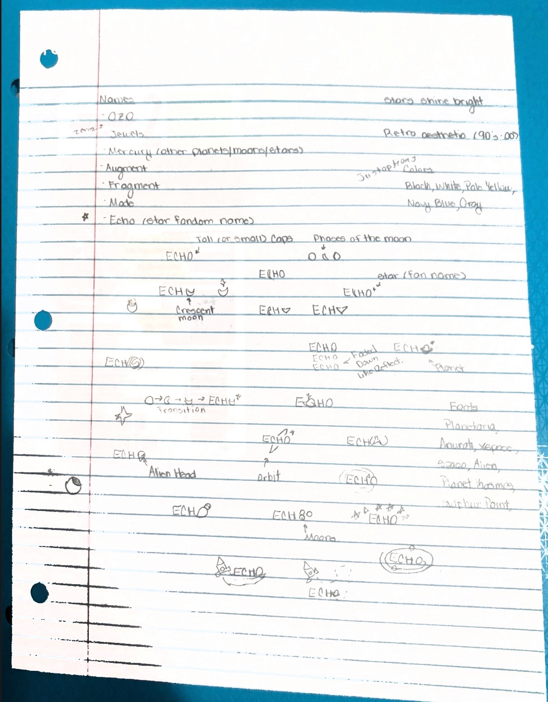
I brainstormed words that were related to music with mind mapping. It helped me generate many ideas and after a while, I found out what word I wanted to use- ECHO.
I sketched any thoughts or ideas that came to my mind on paper as I referred to the mind map I created on Procreate. I scanned the paper into a PDF for later use.
It may be difficult to see because of the quality of the scan but there were many ideas that I was coming up with for this logotype. Over two days, I was sketching out different shapes, combinations of that with letters, and more words to use.
Once I felt that the paper sketches were sufficient, I moved onto Procreate to sketch some of the designs that could work.
I later added colors, many of which could have been beneficial because of the space theme.
A paper filled with sketches of the ECHO logo.
The mind map took me about 10-15 minutes to complete in class. During that time, I thought of terms (and related ones) to figure out the name of the company/music group. With a background in music, I was familiar with most of the common terms. I separated the terms by colors as I went through so that it would be a bit easier to see.
After I chose a handful of logos, I created cleaner sketches in Adobe Illustrator in black and white. This helped create some designs that would stand out on its own. Like how people can identify the Nike Swoosh logo from a mile away. The red stars in the sketch concepts represent some of the other logo designs that I was interested in.

A mind map of musical terms. Created on Procreate.
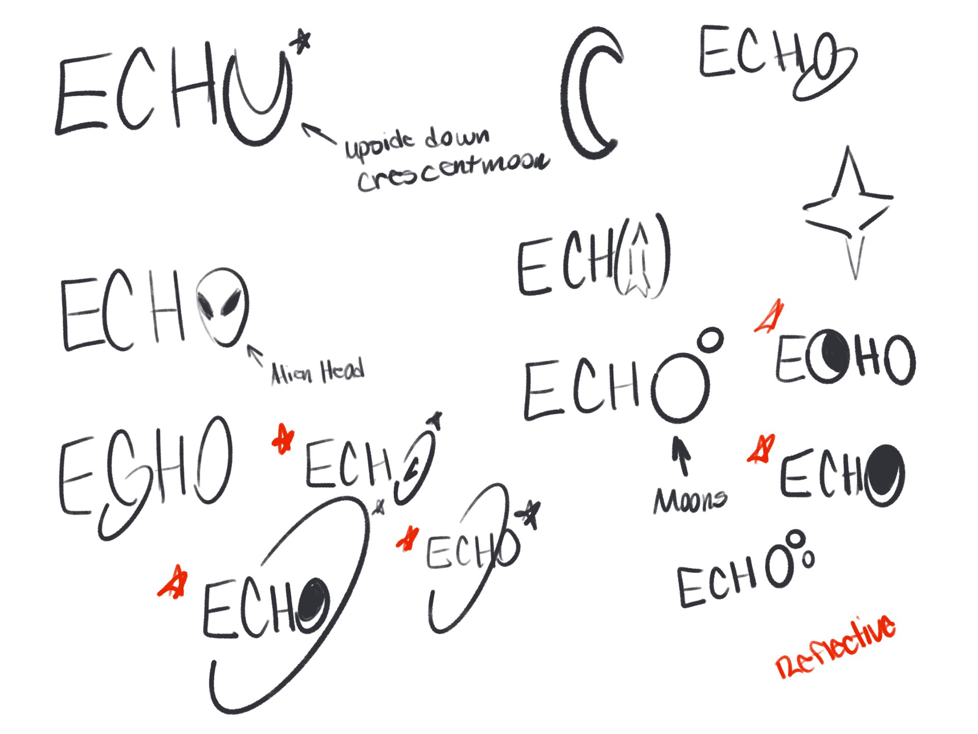
Sketch concepts for the ECHO logo. Created on Procreate.
I've developed six different alternative styles for the ECHO logo. I used a combination of two fonts: Hyper Helix and Omega Centauri to create the logotype. I wanted to have a modern yet astrological mood for marketing the group. The logo and tagline will be used for media like music videos, TikToks, or Magazines. I also note in the style guide that the logotype should be readable. The yellow is only reserved for the stars in the main logo.
The two stars represent the fandom and the music group. Because they both shine bright! The omega symbol is used for the 'O' in ECHO represents eternity. And since the stars are close together, the fandom and music group will stay together for eternity.

The main ECHO Logo. The stars are Naples Yellow.
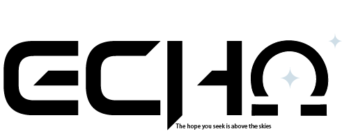
The secondary ECHO logo with tagline. The stars are Columbian Blue.
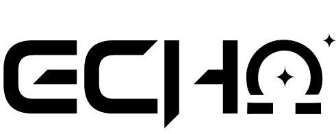
A black and white version of the logo without the tagline.
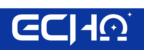
The first variation of the logo with an Egyptian Blue background.

The second variation of the logo with a Dim Gray background.
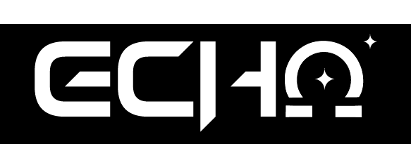
The third variation of the logo with a Black background.
Key Takeaways
Overall, this was an interesting project to work on for Visual Design 1. I was able to explore more of Adobe Illustrator's capabilities for logotype designs. Furthermore, I was able to challenge myself to use a program outside of my comfort zone. When given the time, I would want to create mockups for ECHO's merchandise for different mediums.
It was a challenge trying to choose fonts that could help make ECHO stand out while also staying within the realm of music as well. If it weren't for my initial planning and sketches, I would've had a more difficult time trying to design the logo. Without them, I definitely couldn't have developed the numerous ideas I've had!